 In a fast-changing digital world where social algorithms shift and ad costs rise, email marketing remains one of the most consistent and cost-effective ways to stay connected to your audience.
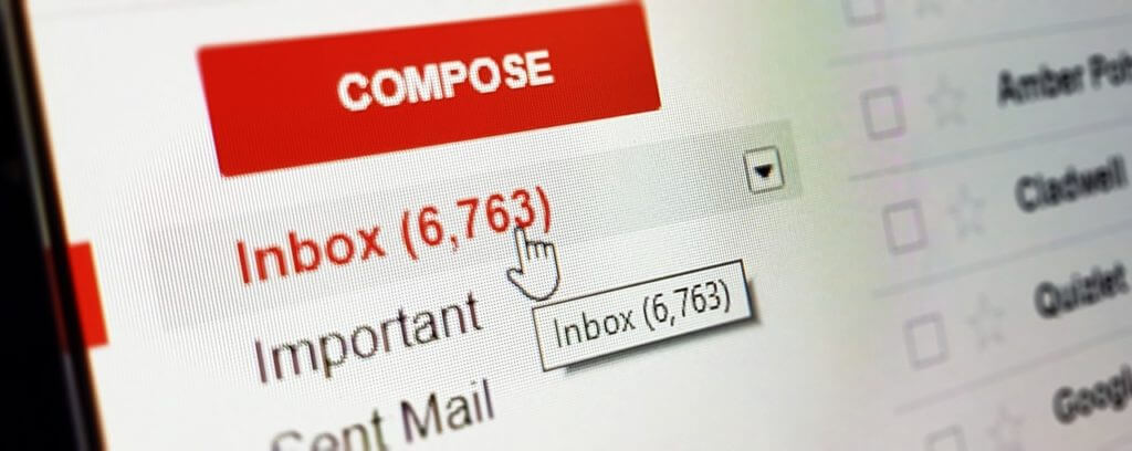
Your email list is one of your most valuable marketing assets – it’s permission-based, direct, and personal. But with inboxes more crowded than ever, a great message isn’t enough. The way your email looks, functions, and feels plays a major role in whether or not it gets opened, read, and clicked.
To help your emails stand out and perform their best, here are six smart, evergreen tips to guide your email design and formatting strategy:
1. Break Up Copy Into Easy-to-Digest Paragraphs
People read differently on screens than on paper – and even more differently on mobile.
Long, dense paragraphs are a fast track to deletion. Instead, aim for bite-sized sections of text that are easy to scan. Use bold headings, short sentences, and line breaks to help readers quickly find what matters.
- Use 2–3 sentence paragraphs.
- One main idea per paragraph.
- Make use of bullet points when listing features or benefits.
Tip: Try reading your email out loud – if you find yourself running out of breath, it’s probably too long.
2. Use High-Quality, Brand-Aligned Visuals
Images and graphics add depth and personality to your message – but only when they’re used well.
Ensure all visuals are crisp, relevant, and on-brand. Avoid pixelated or overused stock photos. If you’re using team or product shots, make sure they’re sized appropriately and retain quality across devices.
- Use 72 dpi resolution for web clarity.
- Check mobile scaling so images aren’t cut off or distorted.
- Use alt text for accessibility and improved deliverability.
Bonus: Include visuals that add value, like charts, testimonials, or sneak peeks – not just decorative filler.
3. Make Buttons Clear, Bold, and Tappable
Your email’s call-to-action (CTA) should be impossible to miss – and easy to click.
A strong CTA button invites engagement. But if the text is too small, the color blends into the background, or it’s placed too close to other elements, you risk losing clicks.
Best practices:
- Use high-contrast color for visibility.
- Make text large and action-oriented (“Get My Quote,” “See the Demo,” etc.).
- Leave enough padding so it’s easily tappable on mobile screens.
Test different CTA placements over time to see where your audience responds best – sometimes a well-placed mid-email button performs better than one at the end.
4. Don’t Be Afraid of White Space
White space isn’t wasted space – it’s essential to effective design.
It helps guide the reader’s eye, gives your content room to breathe, and prevents your email from feeling overwhelming. Cluttered layouts reduce readability and can cause subscribers to tune out entirely.
- Allow spacing between content blocks.
- Separate images from text with clean margins.
- Use white space to spotlight your CTA.
The cleaner your layout, the stronger your messaging.
5. Stick to Your Brand’s Fonts and Colors
Visual consistency builds brand recognition and trust – especially in email, where tone and design need to be cohesive.
Establish font and color standards for your emails and stick to them across campaigns. It not only supports your branding, but also creates a more professional, unified experience for your audience.
- Limit yourself to 1–2 fonts.
- Use color for emphasis – backgrounds, buttons, highlights – not everything.
- Make sure all text is easily legible on both light and dark backgrounds.
Knockout text (white on a color background) is great for CTA buttons, but generally should be avoided for longer sections of copy due to readability concerns.
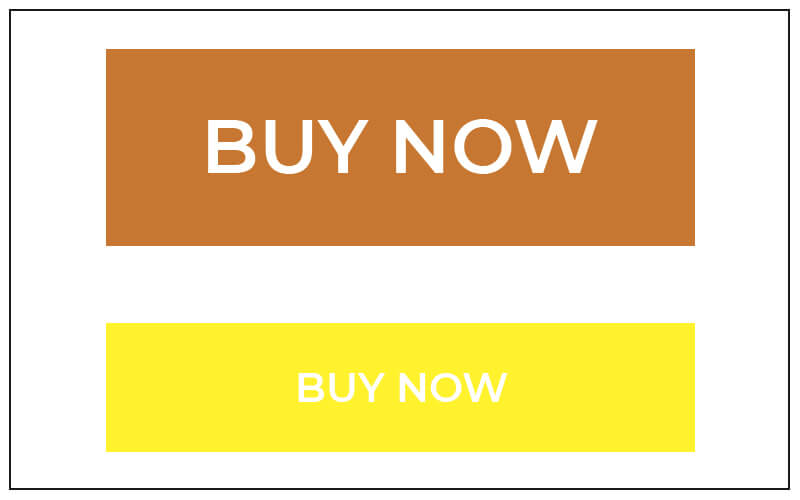
An orange button with large, white text makes it easy to see the call-to-action whereas the yellow button with white text is too small and too difficult to read.
6. Don’t Be Afraid of White Space
White space isn’t wasted space – it’s essential to effective design.
It helps guide the reader’s eye, gives your content room to breathe, and prevents your email from feeling overwhelming. Cluttered layouts reduce readability and can cause subscribers to tune out entirely.
- Allow spacing between content blocks.
- Separate images from text with clean margins.
- Use white space to spotlight your CTA.
The cleaner your layout, the stronger your messaging.
7. Stick to Your Brand’s Fonts and Colors
Visual consistency builds brand recognition and trust – especially in email, where tone and design need to be cohesive.
Establish font and color standards for your emails and stick to them across campaigns. It not only supports your branding, but also creates a more professional, unified experience for your audience.
- Limit yourself to 1–2 fonts.
- Use color for emphasis – backgrounds, buttons, highlights – not everything.
- Make sure all text is easily legible on both light and dark backgrounds.
Knockout text (white on a color background) is great for CTA buttons, but generally should be avoided for longer sections of copy due to readability concerns.
8. Test, Track, and Optimize
No matter how great your design is, testing is critical.
Different devices, email platforms, and operating systems render emails differently. Before you send to your full list, test your email in multiple environments.
- Preview on both desktop and mobile.
- Check rendering in common inboxes (Gmail, Outlook, Apple Mail, etc.).
- Click every link and button to confirm functionality.
After sending, analyze your results:
- What was your open rate?
- Which links got the most clicks?
- Where did people drop off?
Use that insight to improve future emails – whether that means adjusting your subject lines, design layout, or timing.
Final Thoughts: Email Is Still Working – If You Work It Right
When thoughtfully designed and strategically executed, email marketing is still one of the best tools to engage your audience, drive conversions, and strengthen your brand.
Want help crafting emails that get results? Our team at Sabre Digital Marketing is ready to help you develop branded email templates, write compelling copy, and design mobile-optimized layouts that reflect your voice and convert readers into customers.
Let’s chat. Get in touch »